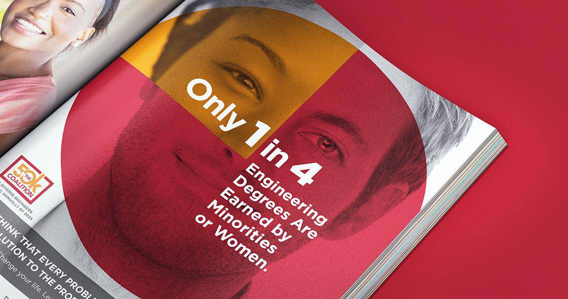
The 50K Coalition brand identity needed to be developed from the ground up.
The initiative behind 50K addressed the need for a more diverse engineering workforce, and now we needed to develop the branding to support this program and visually communicate this need. The new brand identity supported the efforts of countless diversity organizations and individuals that support diversity in engineering.

At the heart of the brand identity is a bold, simple wordmark that uses straight-forward typography, set in a unique way. The ascender of the lowercase “k” in “50K” breaks the frame around the mark, as a nod to breaking boundaries and the use of the brand red and orange offer a sense of excitement and positivity. We balance the boldness of color with grayscale imagery the features young people from a diversity of backgrounds. Overall, the brand identity and supporting campaign is fresh, inviting and inspiring.
The campaign included a website where visitors could learn more about the initiative, how organizations are supporting to graduate 50,000 diverse engineers by 2025, and how they themselves can contribute. PowerPoint templates, advertisements, and other marketing collateral supported the campaign and its partners. And, video rounded out the campaign, featuring testimonials of campaign partners discussing the need to drive this initiative and how others could help.
Email us or use our live chat feature below to learn more about how you can cause a stir with a brand identity.

