The Acoustical Society of America Rebrand
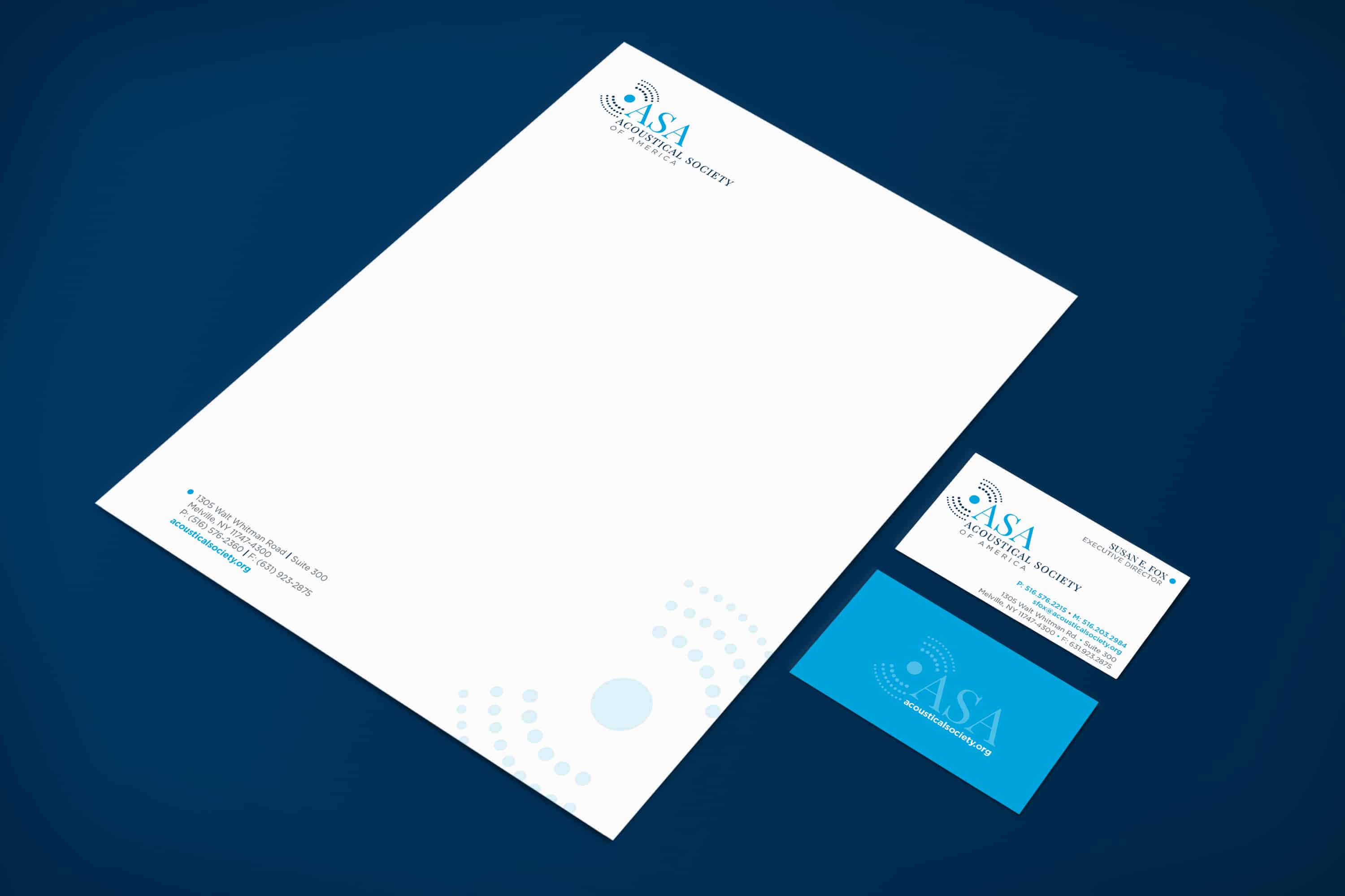
A primary goal of the rebrand was to update ASA’s organizational identity. The first step was creating a new logo that paid tribute to the original logo and ASA’s interdisciplinary heritage while maintaining a modern look and feel reflective of ASA’s mission and the diversity of its 7,500 members worldwide.

The ASA logomark takes inspiration from a circular wave pattern used in the organization’s legacy logo. The blue dot at the center represents an organization from which innovation in acoustical science emanates, while the individual dots that form the wave pattern reflect a society comprised of individuals with diverse focuses, backgrounds, and experiences. The ASA Logotype was designed to honor the typographical heritage of the ASA’s legacy logo—the ASA initials and full name are set in a classic serif font. Elegant and timeless, this updated typeface reflects a society that values scientific rigor and the sharing of knowledge. The color blue has played an important part in ASA’s brand heritage, and we’ve brought it into their new identity. The deeper blue adds a feeling of trust and stability while the brighter blue infuses energy and optimism.
Along with the new master brand, we developed a complete brand identity system, brand guidelines, and other supporting materials.

Acoustical Society of America’s Journal Redesign
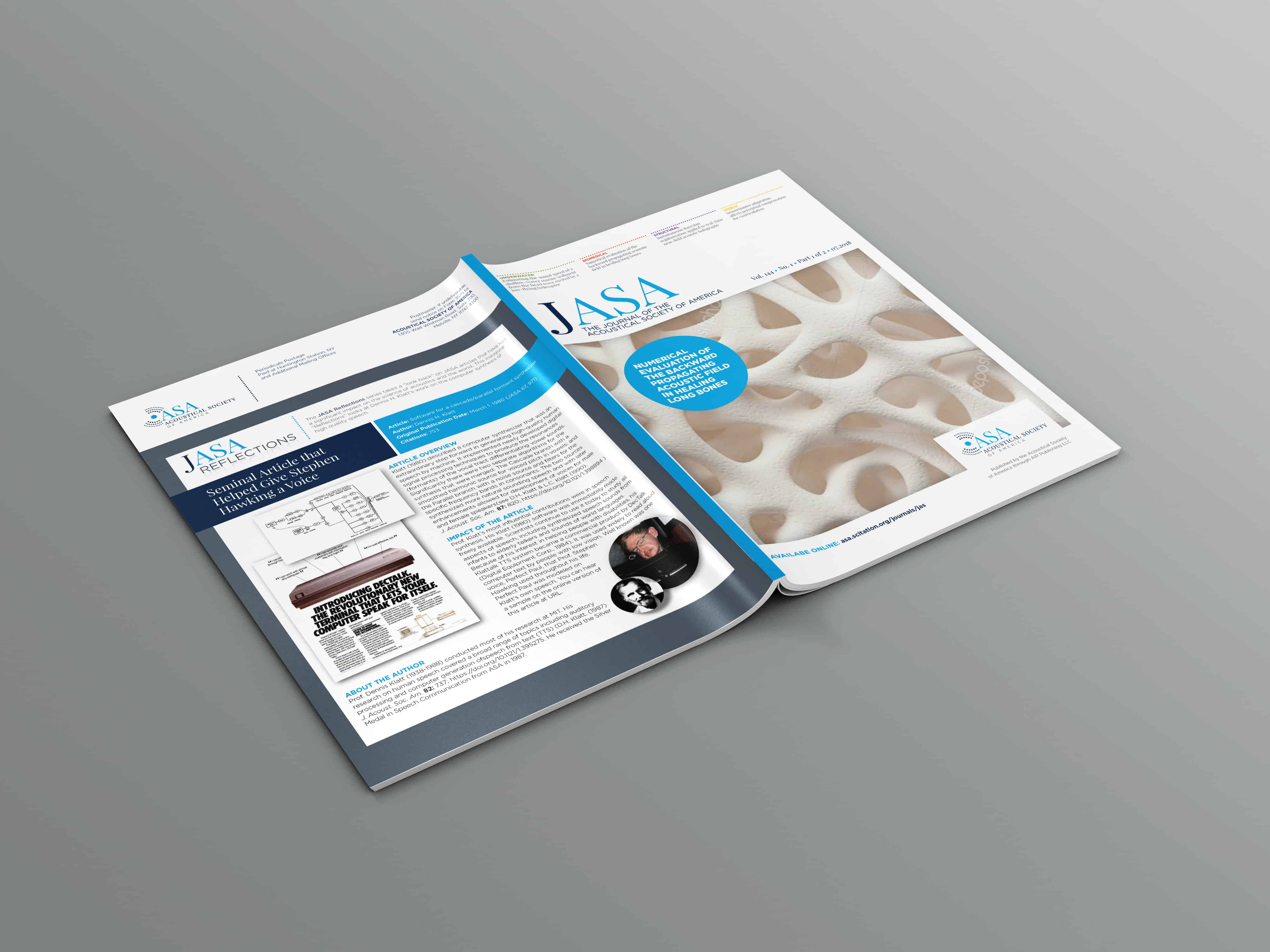
Dovetailing the new brand identity, ASA determined that a redesign of their flagship publication, the Journal of Acoustical Society of America, commonly referred to as JASA, was necessary. They felt it was critical to bring this prestigious and valued publication up-to-date in order to provide a consistent ASA brand experience to readers. Consequently, they wanted to convey a modern, yet timeless, feel that would appeal to today’s acoustician, particularly those beginning their career.
ASA partnered with DJG to execute including cover development, with a cover photo strategy for each issue; interior page redesign, including table of contents, editor listing, etc.; back cover feature article strategy and design; and matching graphics for their digital properties.
The ASA rebrand allowed staff and volunteer leadership to represent ASA in a unified manner when communicating with others and positioned the brand as a progressive, modern and forward-thinking organization among emerging acoustics professionals and the public.


Email us or use our live chat feature below to learn about how you can cause a stir with a rebrand or journal redesign.
