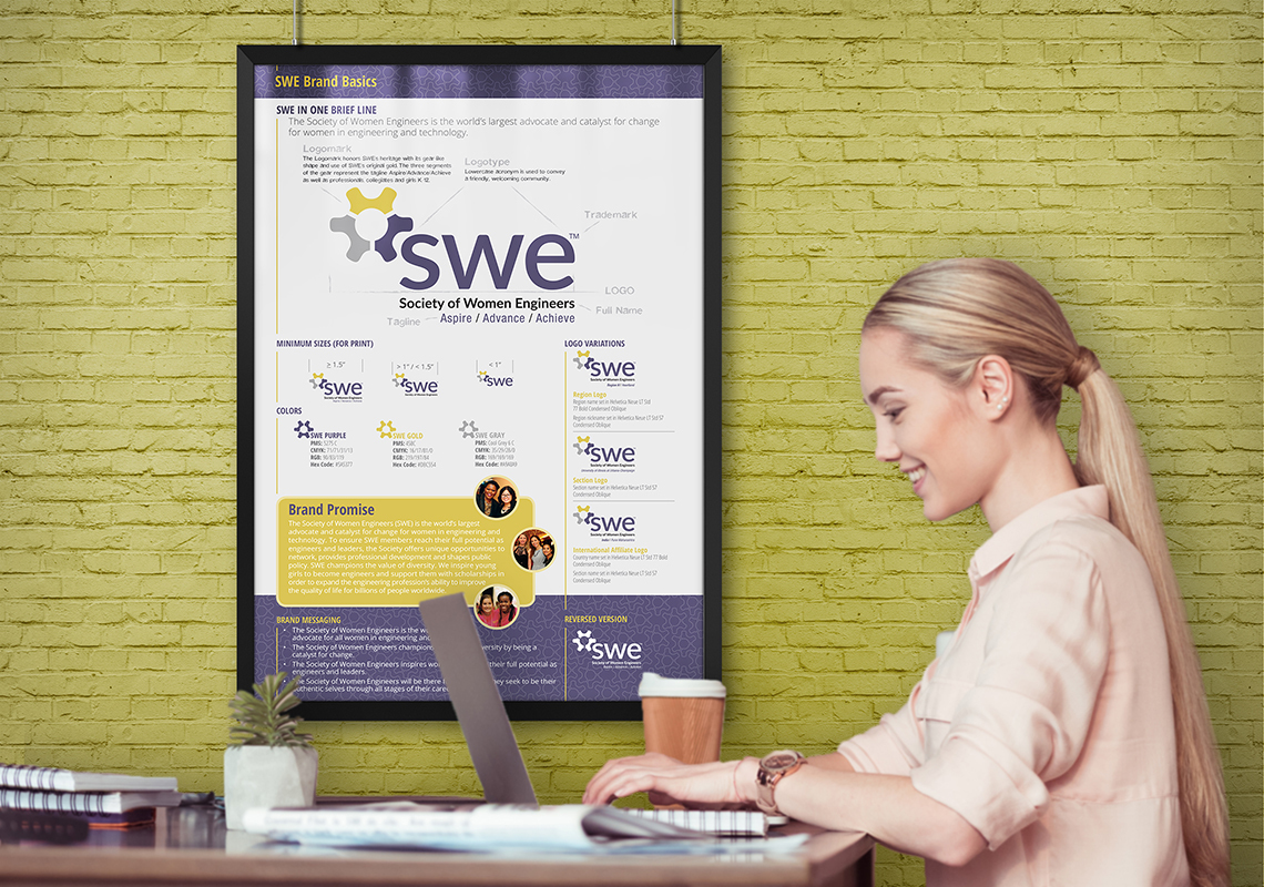
The SWE logo was created in 1950 when SWE was founded.
Over the years, there were slight modifications, but it remained fundamentally unchanged for 65 years. That was until 2013 when SWE approached David James Group to help with an association rebrand, a two-year process that included significant research, Board and member education, and adoption of a new identity by a 40,000+ member association.
DJG worked with SWE leadership to lay out a case and develop a strategy for the association rebranding. Older members who were with SWE when it was founded, or who have been with the Society for many years, were very reluctant to change the identity of the brand fearing the very essence of the organization would go away. Plus, with more than 400 Sections and Regions, and global membership, rebranding was certainly a complex issue. Most local chapters had adopted their own identity over time.
The rebranding process involved significant primary and secondary research; Board, Senate, staff and membership education; and, ultimately, per bylaws, approval by the Senate. Once approval was gained, we got to work and developed a new master brand and a complete brand identity system.
Our approach was to honor SWE’s past while positioning the Society for the future.
We needed to create a brand that reflected the global organization SWE had become and ensured SWE remained relevant to a new generation of women in engineering. Our research started with a brand assessment survey that reached more than 2,500 participants, both members, and non-members.
Older members who were with SWE when it was founded, or who have been with the Society for many years, were very reluctant to change the identity fearing the very essence of the organization would go away. Plus, with more than 400 Sections and Regions, and global membership, rebranding was certainly a complex issue. Most local chapters had adopted their own identity over time.
We worked with SWE leadership to lay out a case for rebranding and develop a strategy to do so. The rebranding process involved significant primary and secondary research; Board, Senate, staff and membership education; and, ultimately, per bylaws, approval by the Senate.
Once approval was gained, we got to work and developed a new master SWE logo brand and a complete brand identity system including SWE brand guidelines. Our approach was to honor SWE’s past while positioning the Society for the future. The work also earned the Society of Women Engineers a 2016 ASAE Gold Circle Award.
Once a brand identity was chosen, educating the membership was approached through monthly communications via email and newsletters about the science of branding and its impact on the growth of an organization. Allowing members to be part of the rebrand was important, but educating them on its significance was what helped combat the naysayers and roadblocks.

Brand consistency was also addressed, as many sections had become accustomed to designing their own logos. A unified brand is crucial in the rebranding process. So, SWE and DJG created 400 unique logos for all current active Sections and Regions and made them easily accessible to members.

The brand launch in 2015 included a full brand identity system including letterhead, business cards, PowerPoint templates, and other marketing materials; 400+ Region/Section logos and brand guidelines to support brand consistency; a brand landing page on the SWE website; a :60 brand launch teaser video; and social media posts/graphics and web updates.

The amount of positive feedback on the new look and feel was tremendous—from new as well as older members. The education process was viewed as being so successful that as SWE went through a governance review, their leadership modeled their outreach after the rebranding initiative.
The rebranding work earned the Society of Women Engineers a 2016 ASAE Gold Circle Award, representing the best of association marketing, membership, and communications.
Email us or use our live chat feature below to learn more about how you can cause a stir with a rebrand.
For more successful rebranding examples, check out our Obesity Medicine Association work.
